

 Verlauf
PostScript Type 1 fonts/Adobe support 'end of life' - "Bauer Bodoni" is dead - nope.
 erstellt von: simon -
|

 Alle Kapitel anzeigen
Schriften vom „Type 1“ (aka PostScript, PS1, T1, Adobe Type1, Multiple Master, MM) lassen sich weiter mit allen Affinity Apps verwenden.
Adobe stellt im Jänner 2023 den Support gänzlich ein.
Photoshop ignoriert ab Version 23.0 das Vorhandensein von Type 1-Schriften, auch wenn die Schriften im
Betriebssystem sonst verwendbar sind.
Adobe-Dokumente die mit ursprünglichen „Type 1“-Fonts gesetzt wurden,
melden folglich „Fehlende Schriften“
https://helpx.adobe.com/at/fonts/kb/postscript-type-1-fonts-end-of-support.html
Type 1 = PostScript Type 1 mit den Dateien .pfb/.pfm
Unter Windows 10 können „.pfm/.pfb“-Dateien über die alte Schriftverwaltung weiter
installiert werden
Standardordner:
C:\Windows\Fonts oder
C:\Users\username\AppData\Local\Microsoft\Windows\Fonts
Mac OS.
Ab Mac OS
Ventura ist das Öffnen von „Postscript-Dateien“ (.ps, .eps) mit
der internen Preview-App nicht mehr möglich.
Drittanwendungen wie
Affinity können die Dateien natürlich weiterhin lesen. (Mac OS
Info: https://support.apple.com/en-us/HT213250)
Demo Type 1 - (2022-12-04)
Installation unter Windows (hier „22H2“ durch Doppelklick auf die PFM-Datei und „Installieren“.
Schrift „Bauer Bodoni BT“ von 12/1998.
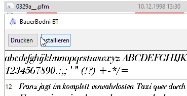
Abb. „.pfm“- mit zugehöriger „.pfb“-Datei installieren
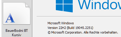
Abb. Im Betriebssystem verankerte Type-1 Schrift
Die Schriftart erscheint ohne Neustart in Affinity Photo V2.0.0 auf:
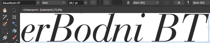 Abb. Affinity Apps V2
Bei OpenType-Schriften werden die Kerning-Tabellen von Affintiy selbst aus der Schriftdatei ausgelesen.
Für Type1-Schriften wird die zugehörige Windows API angefragt. Mac OS liefert diese Daten nicht.
Mac OS unterstützt TrueType (.ttf),
Variable TrueType (.ttf), TrueType Collection (.ttc), OpenType (.otf)
und OpenType Collection (.ttc). Ab Mojave funktionieren OpenType-SVG
fonts nicht mehr.
Ref. https://www.linotype.com/de/1245454/bauer-bodoni-schriftfamilie.html
Giambattista Bodoni (1740-1813) was called the King of Printers;
he was a prolific type designer, a masterful engraver of punches and the most widely admired printer of his time.
His books and typefaces were created during the 45 years he was the director of the fine press and
publishing house of the Duke of Parma in Italy.
He produced the best of what are known as "modern" style types, basing them on the finest writing of his time.
Modern types represented the ultimate typographic development of the late eighteenth and early nineteenth centuries.
They have characteristics quite different from the types that preceded them; such as extreme vertical stress,
fine hairlines contrasted by bold main strokes, and very subtle, almost non-existent bracketing of sharply defined hairline serifs.
Bodoni saw this style as beautiful and harmonious-the natural result of writing done with a well-cut pen,
and the look was fashionable and admired.
Other punchcutters, such as the Didot family (1689-1853) in France, and
J. E. Walbaum (1768-1839) in Germany made their own versions of the modern faces.
Even though some nineteenth century critics turned up their noses and called such types shattering and chilly,
today the Bodoni moderns are seen in much the same light as they were in his own time.
When used with care, the Bodoni types are both romantic and elegant,
with a presence that adds tasteful sparkle to headlines and advertising.
The Bauer Bodoni was done by Heinrich Jost for Bauer Typefoundry in 1927.
This version has finer details of the original Bodoni types.
It works well for headlines, logos, advertising.