
 Verlauf

 Alle Kapitel anzeigen
 voriges Kapitel
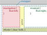
Kombiniert man Elastic Layouts und Liquid Layouts, wird dies "Elastic-Liquid Hybrid" genannt: Dabei skaliert das Layout bis zu einem bestimmten Prozentwert entsprechend der Textgröße, darüber hinaus aber nicht mehr (Angaben für das Hybrid-Layout in Fett):
Dreispaltiges Hybrid-Layout
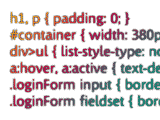
body {
text-align: center;
font-size: 62.5%;
max-width: 98%;
}
#wrapper {
width: 70em;
max-width: 98%;
margin: 0 auto;
text-align: left;
}
#content {
width: 52em;
max-width: 75%;
float: right;
}
#main {
float: left;
width: 32em;
max-width: 66%;
}
#other {
float: right;
width: 18em;
max-width: 32%;
}
#nav {
width: 18em;
max-width: 23%;
float: left;
}
#footer {
clear: both;
}
Dreispaltiges Hybrid-Layout